Standard-Projects is a design agency
Standard-Projects

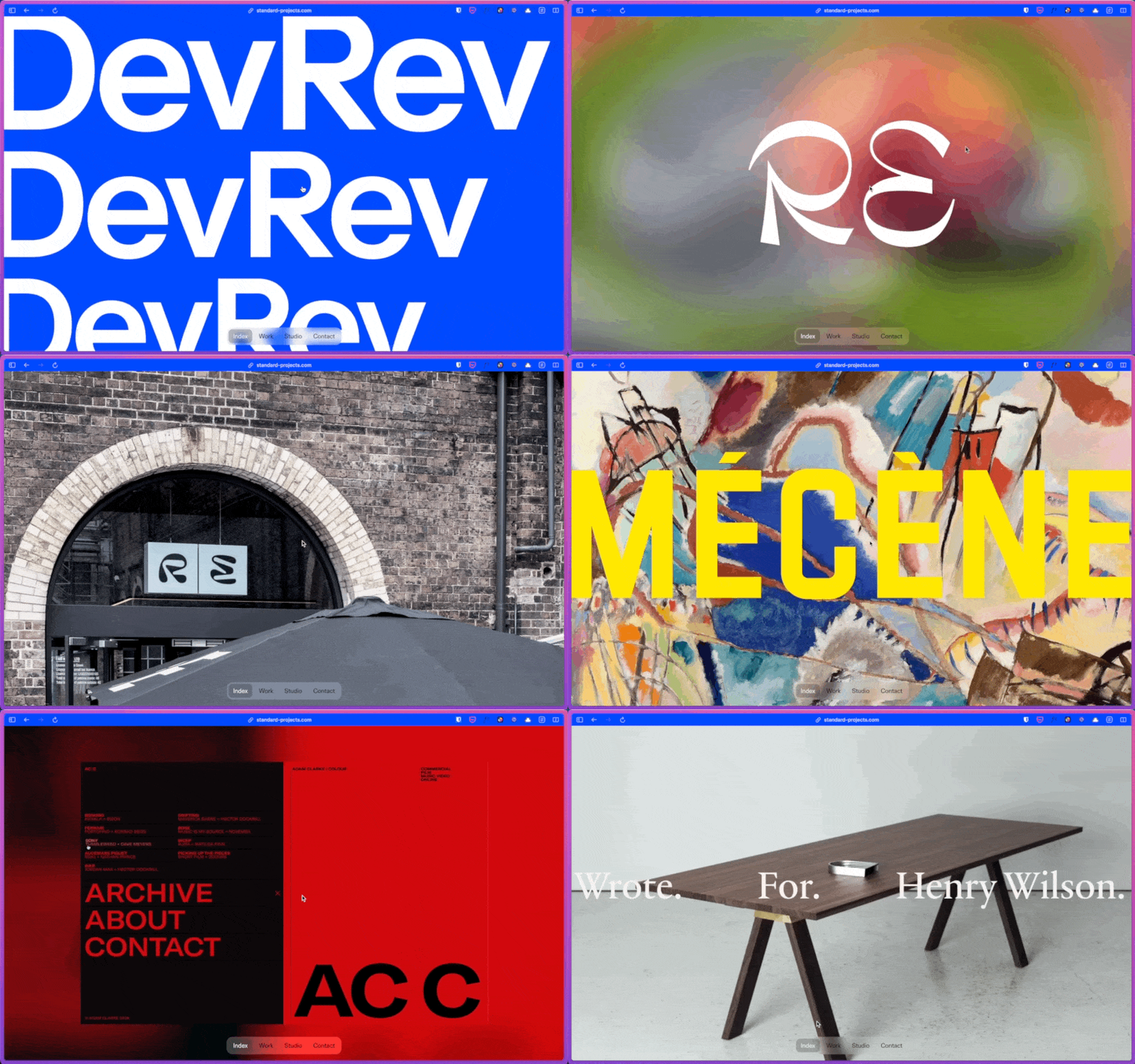
I didn’t want to add this site at first because it does something I dislike: The first thing you see is a full-screen fast video.
These videos make me dizzy.

I cannot focus on anything; it feels like a desperate attempt to grab attention.
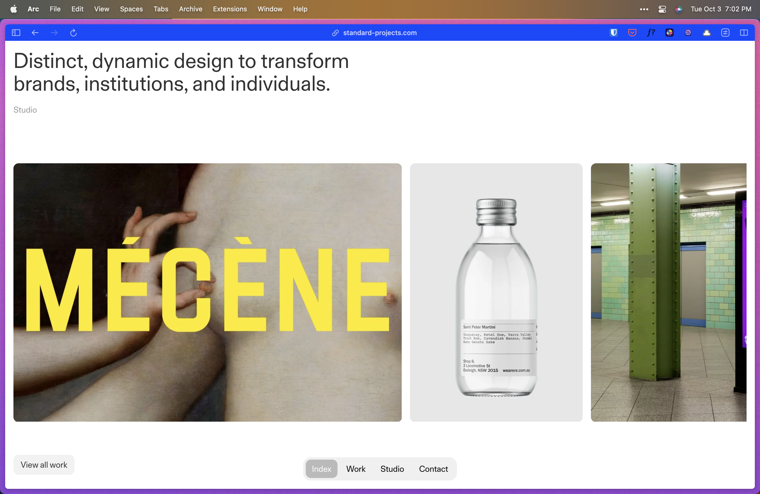
But if you scroll a bit, you’ll find what I feel is a better first impression.

The slogan/hero explains what we have just seen. It explains why the video had to be distinct and dynamic. The studio link is weird, but it doesn’t bother me.

The navbar is finally visible. Although it was visible while the video played, so much was going on that I had to scroll down without looking.
There is no clear CTA, but the navbar is always visible and includes the “Contact” link.

I believe 99% of all websites need a clear CTA. But in this case, I am sure they do not use their website as a marketing tool. Of course, I cannot be entirely sure, but how it is structured leads me to believe they use the website as a pitch deck to demonstrate past work and who they are.
In other words, this website is meant to be browsed with someone from Standard Projects by your side to guide you along.

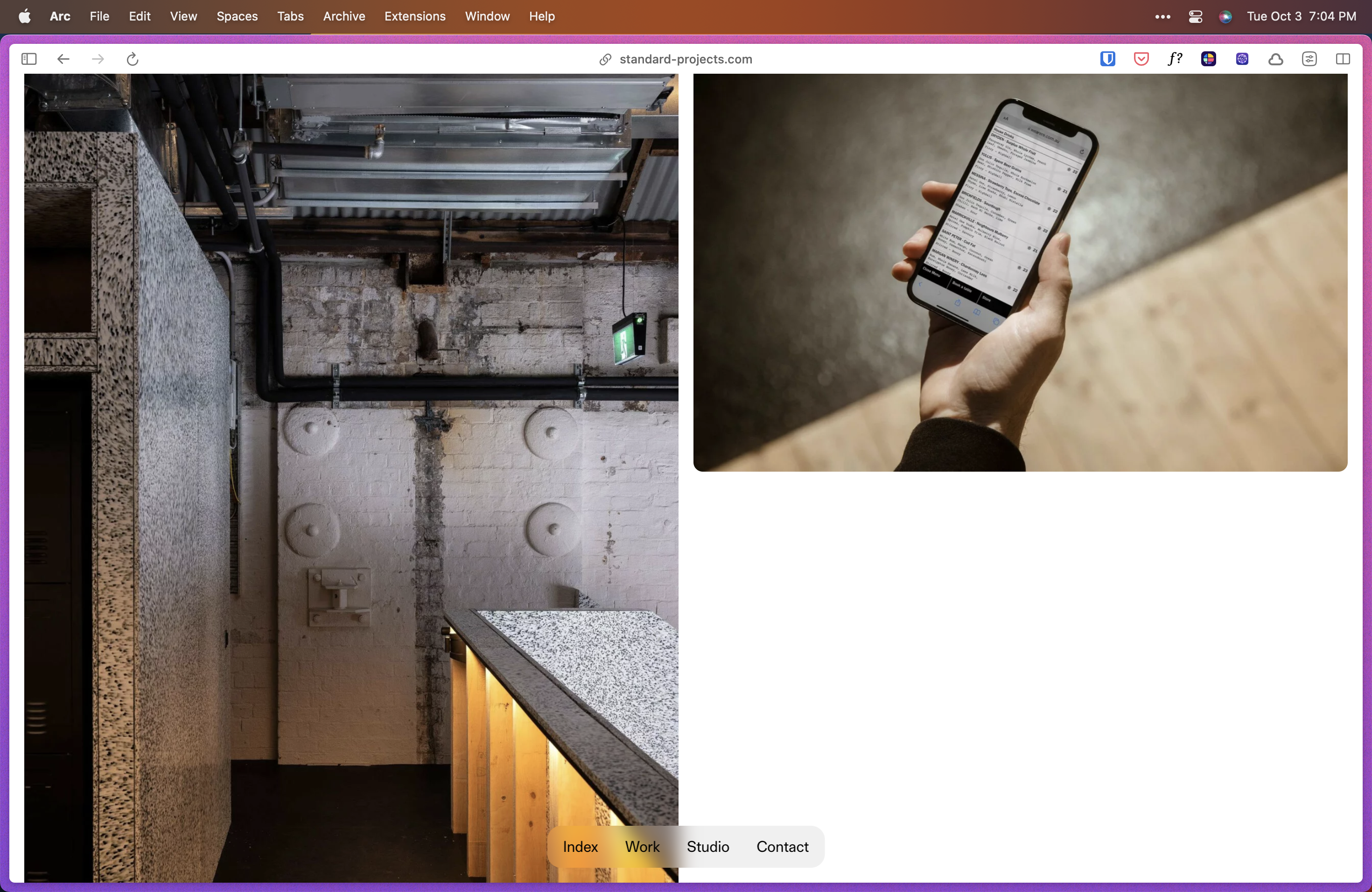
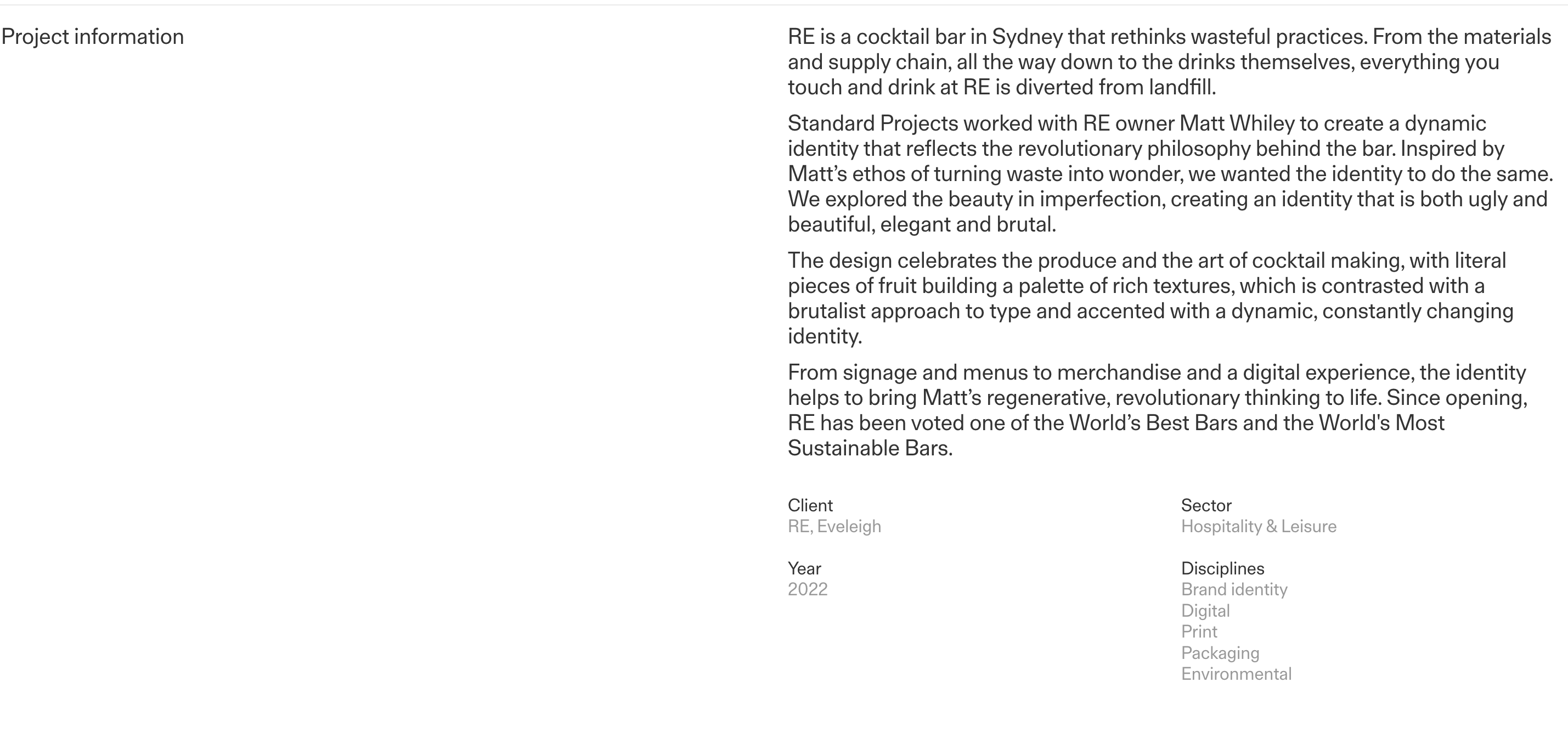
For example, how the case studies are laid out makes me believe it should be explained in person. There needs to be an explanation text. You have to scroll long pages to get to a summary.

I can imagine someone presenting this website while narrating what each picture is.
Visual Design
It is impossible not to admire the attention to detail in Standard Projects.
I especially like how all the titles stick to the top left of every page.
It sometimes feels like a magazine; layout is one of the biggest strengths of this website.
Standard Projects has one of the most straightforward and beautiful footers I’ve ever seen.

Reviewed on:

